White ink - when to use and why
We love white ink, it keeps colours vibrant and opens up lots of smart little printing opportunities.
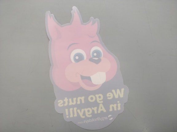
Let's start with an example of useful white ink usage.
The entire surface area of this sticker is given a layer of white ink, with coloured ink then layered on top to form the design.
The reason for this, is to ensure that the colours are bold, bright and as intended - no matter what surface the sticker is stuck to*.
*On this occasion this sticker is designed to be placed on windows, so the potential for strong light shining on the sticker could have made it mildly transparent if not for the white ink.

Lovely eh?
But let's go a bit further into depth about why the White Ink was so important here:
Peely wally designs don't cut the mustard
- pale and sickly in appearance."his face assumes a peely-wally hue"
Great designs can meet unexpected pitfalls when it comes to the printing process. Whilst the lovely yellow and blue tones may look great on the computer screen, printing them on to a non-white surface often led to the colours looking washed away, or as us Scots say peely-wally . You don't want an unexpectedly translucent finished product, so thankfully White Ink can save the day. After all, you wouldn't want your design to come out poorly because of printing technology setbacks, and we wouldn't want to take on a job that we didn't think we could do efficiently and to the highest standard.
How does White Ink conquer printing challenges?
The most common usage for white ink, is to act as a base coat - much like painting a wall white before adding your new colour.
Printing a blue on to cardboard goes from a poor, dull result, to being as vibrant as intended once the white ink base coat is layered underneath.
CMYK (Cyan, Magenta, Yellow and Key) is the most popular way to print nowadays, and this is intended to be used on a white surface. Colour on white - perfect, bright, bold, lovely.
However, possibilities and ambitions have grown. We get all sorts of exciting and clever print jobs passed our way, when white surfaces are left behind and the all important white ink needs to step in to ensure perfect colouring.
We always bang on about consistency, especially when it comes to branding. It's important that the colours used to represent a brand stay consistent, so white ink becomes crucial to ensure that no logos/themes become washed out.
Further thoughts on White Ink usages
A backing layer makes sense, right?
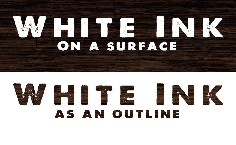
But White Ink can be more useful than a simple layer. Instead of providing a full layer to the design (like in the sticker example at the beginning of this post), we could instead only put white ink behind certain elements of the design such as text. This would make certain aspects of the design 'pop' and really jump out at the viewer.
Also, sometimes white ink is just used as expected. White ink prints a lovely white on non-white surfaces.
It's also a nice technique to print a white layer around a surface with certain parts left clear, to form the design in negative space.