So, you think you're clever?
Marketing . • November 6, 2019
You can design for digital with your eyes closed. You’ve been asked to design for print, same thing right? No! Here are some tips to give your printer a break.
1. Page numbers
www.flickrgraphics.com
On screen.
But what about the binding?
Unless the publication is going to be bound so that it lies completely flat, your page numbers are going to be lost into the spine once it's opened.
Plan ahead.
https://practicaltypography.com
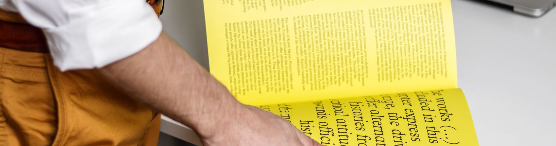
Did you even make it to the end?
Me neither.
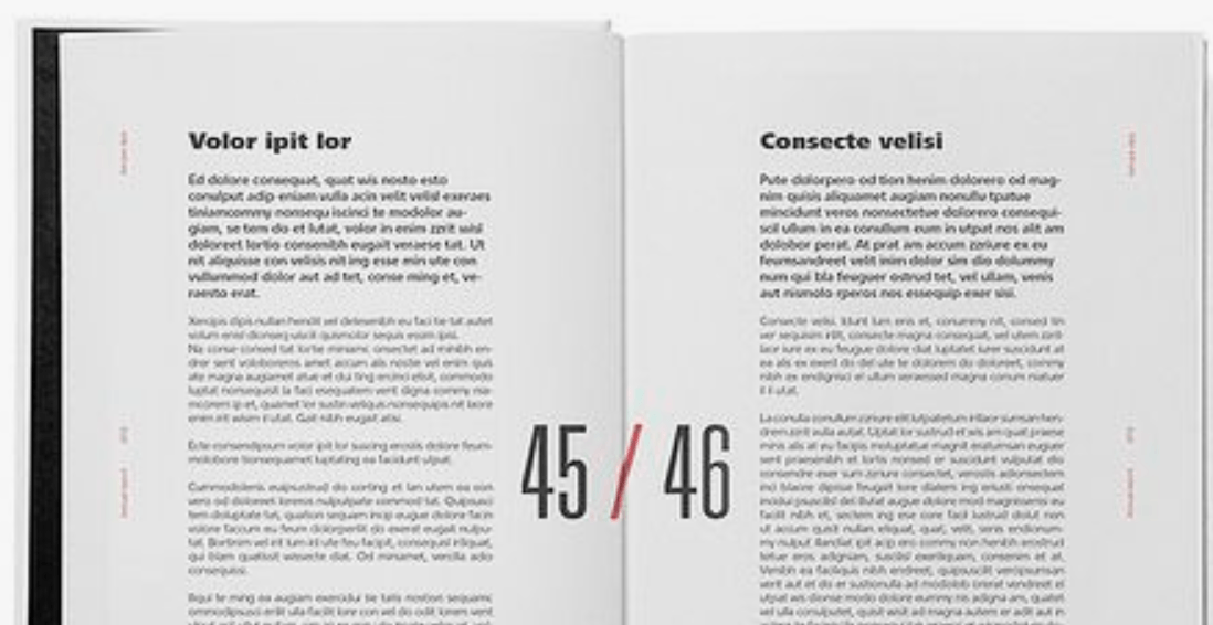
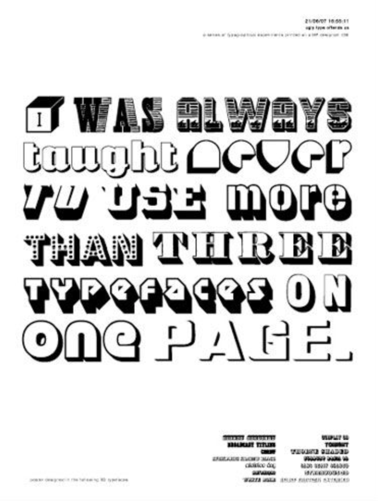
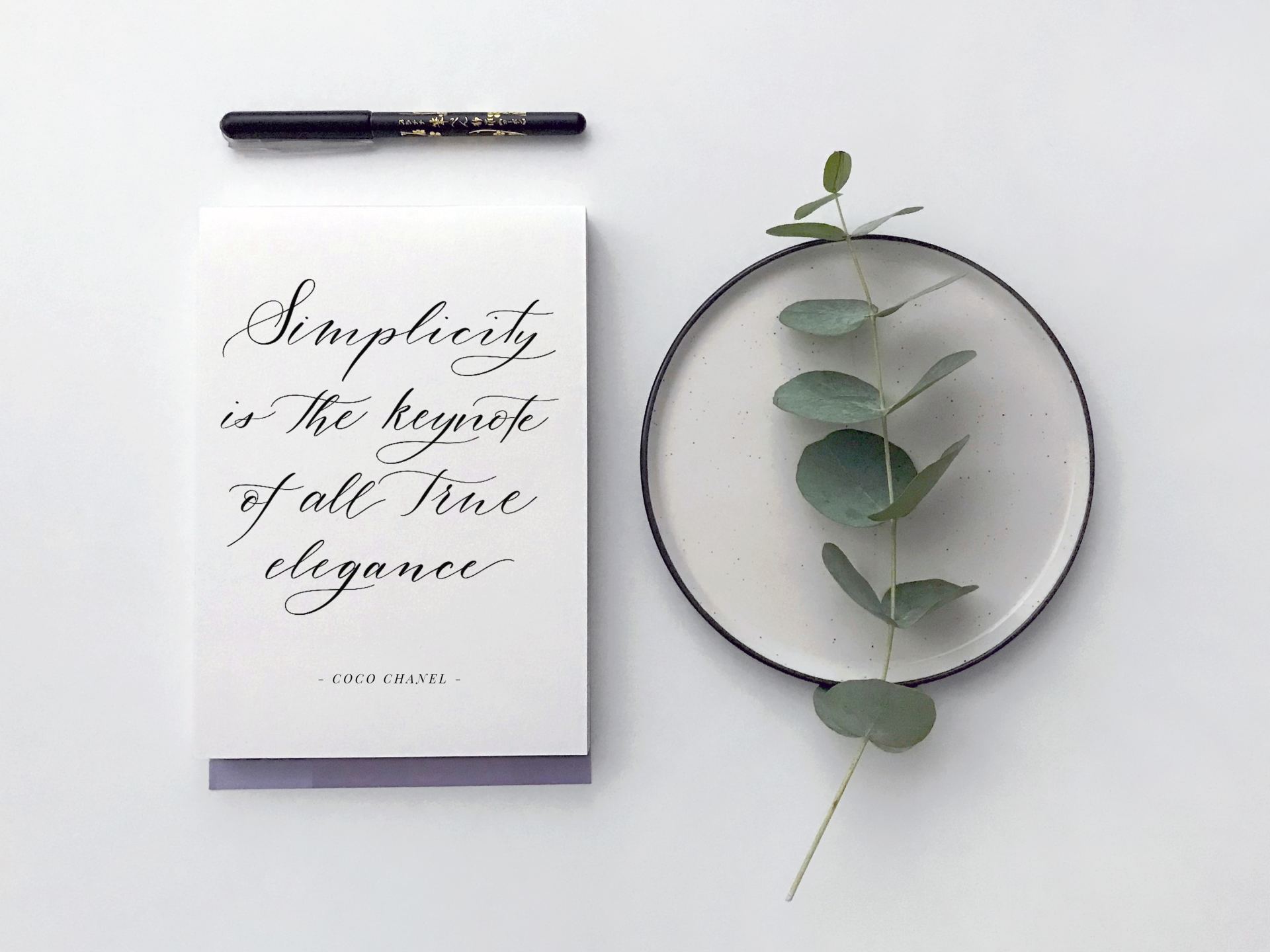
3. Typefaces
https://www.pinterest.co.uk/pin/37576978116785086
Appreciating a good typeface is a big part of the job, it can set the entire tone for your final piece.
If the point is not to be haphazard and chaotic- don't overdo it.
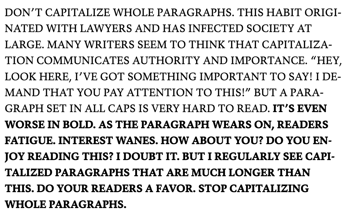
4. Images
Be careful with your images.
Yes, that IS a very pixelated screenshot.
Know your file types!
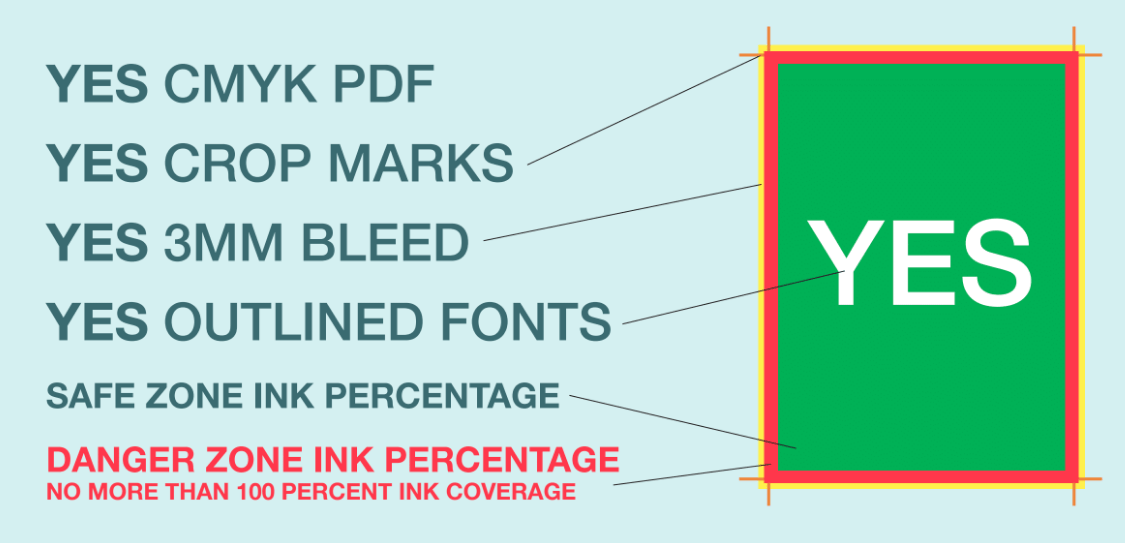
The best way to give your printer crystal clear instructions. This lets them know exactly where it to be trimmed, and avoids any unwanted white borders.
www.supertuffmenus.com
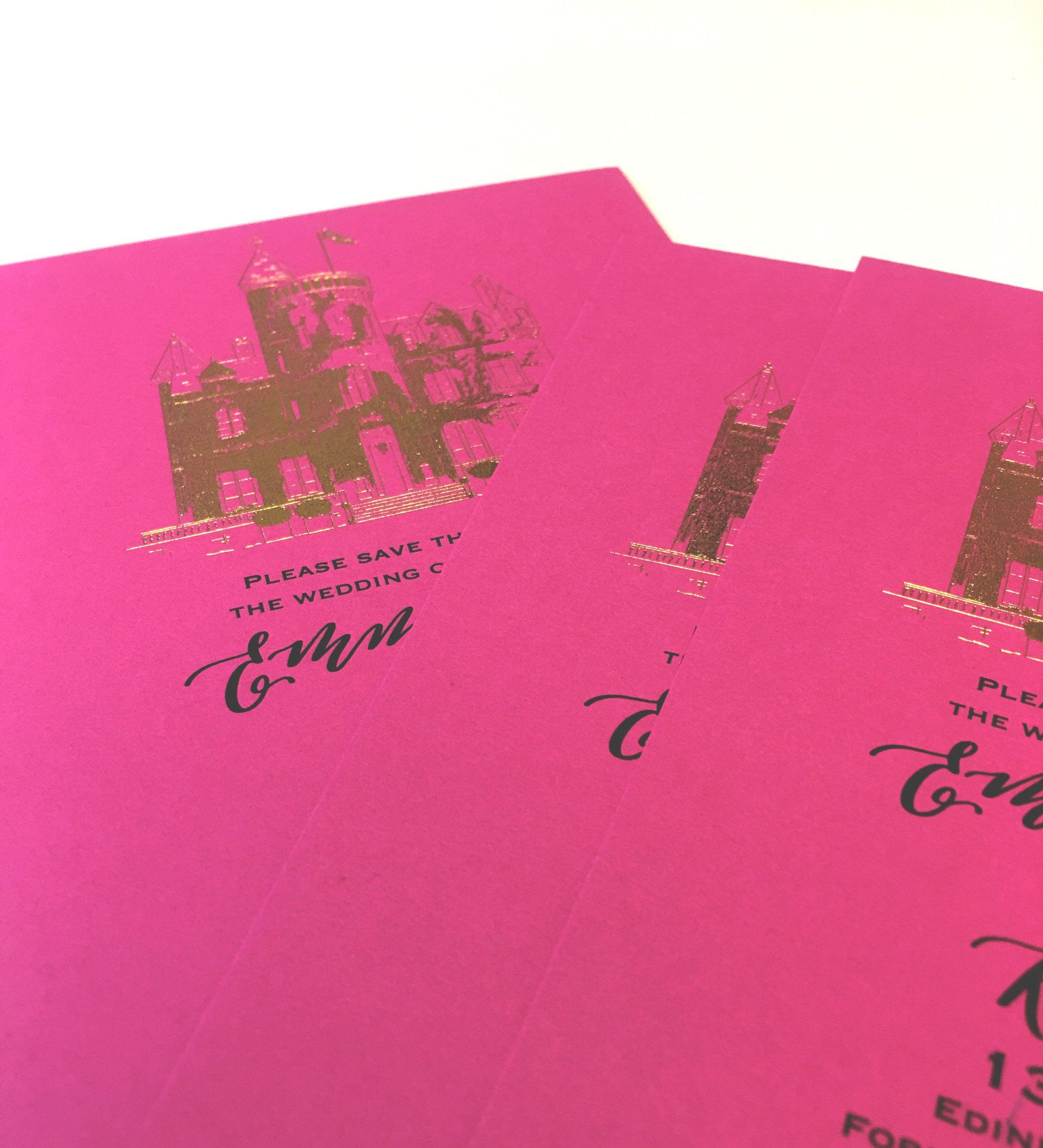
6. Colour
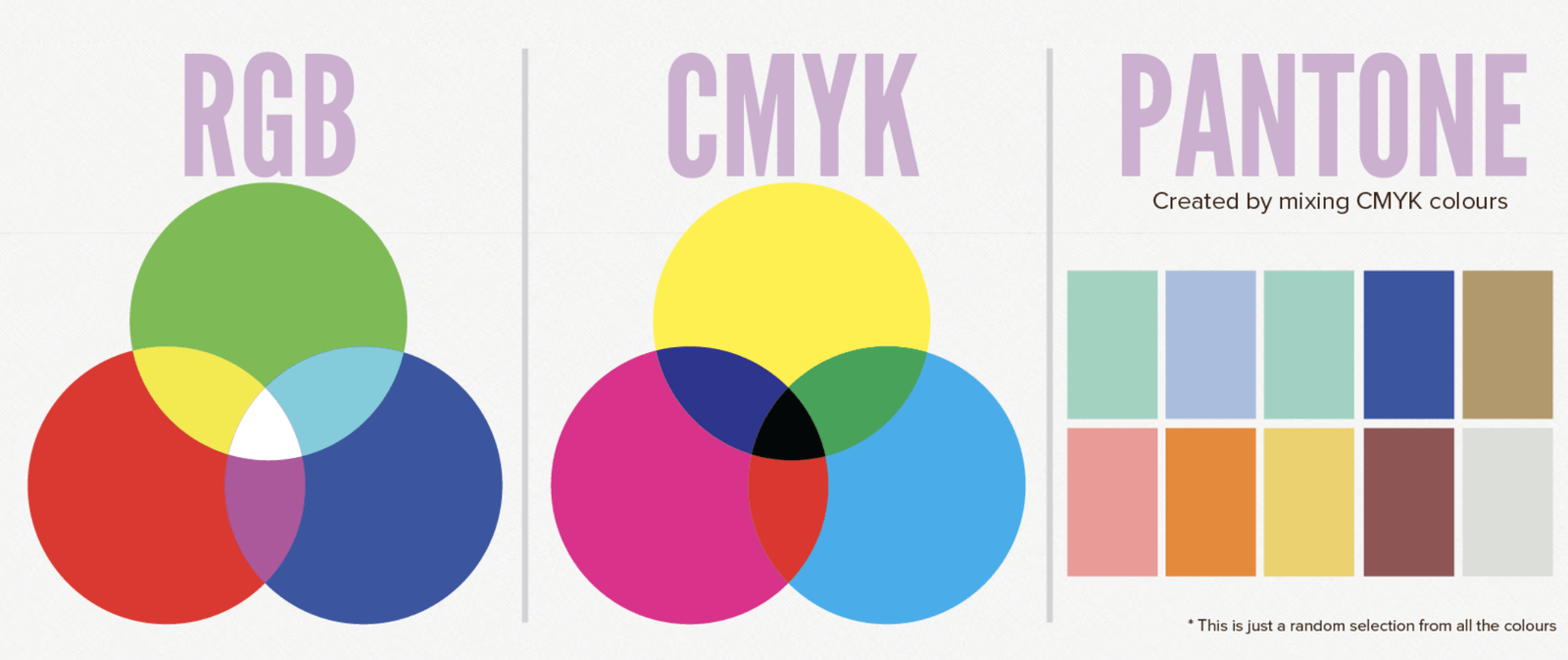
https://www.pandaqi.com/Design/colour-theory-rgb-cmyk-pantone
Ever wondered why that neon green you chose printed so dull?
There are options here, but you need to speak to your printer- mixing inks is an expense!

The gods have spoken, here's your colour of the year. How are you going to incorporate it into your print?


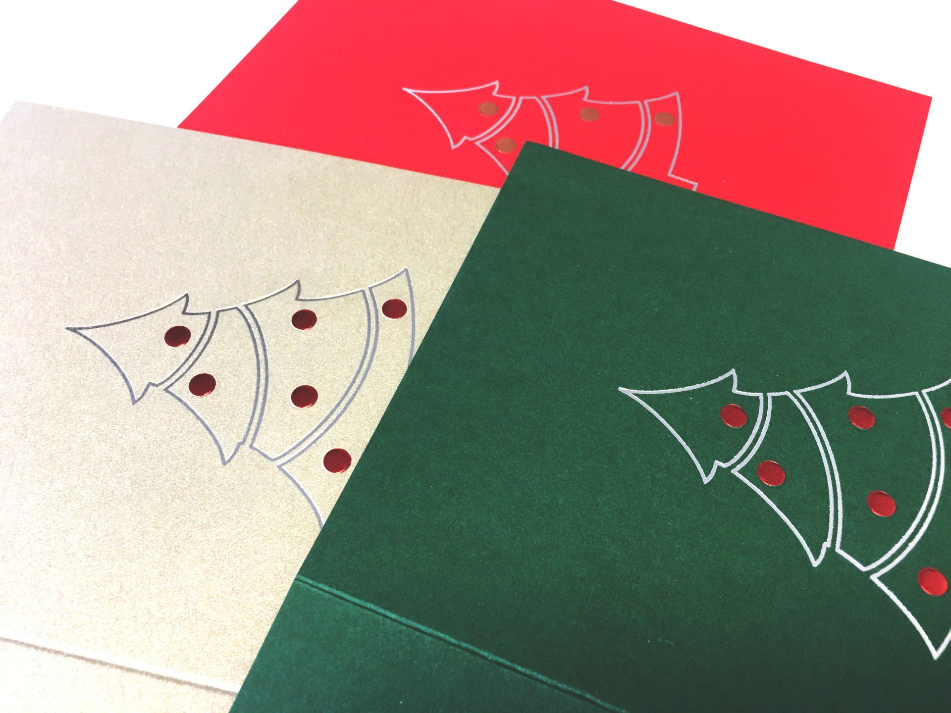
This year we've gone for a clean, simple foiled outline with embossed baubles. Here are some ideas for you.