Slow down
Marketing . • January 14, 2020
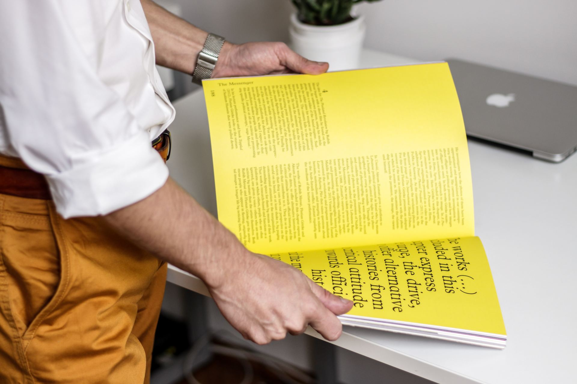
Bespoke printing needs a little bit more TLC

We often have people call us up, frantic. Maybe another printer has let them down or they've just left the deadline too tight.
We can do these jobs. We can work in a hurry no problem.
However!
You must remember that bespoke printing takes a bit of time. To get your printed invitation or brochure just the way you want it there's a process.
To make things run a bit more smoothly (perhaps when your deadline is creeping closer more quickly than you'd like), here are some things we think will help.
Remember to use a CMYK workspace. If you aren't familiar with digital printing you should know that if you have work in RBG format these colours cannot be printed. RGB allows you to have wonderful, vibrant colours on a screen but when we print them CMYK the machine will create the closest thing it can - this might not look as you intended.
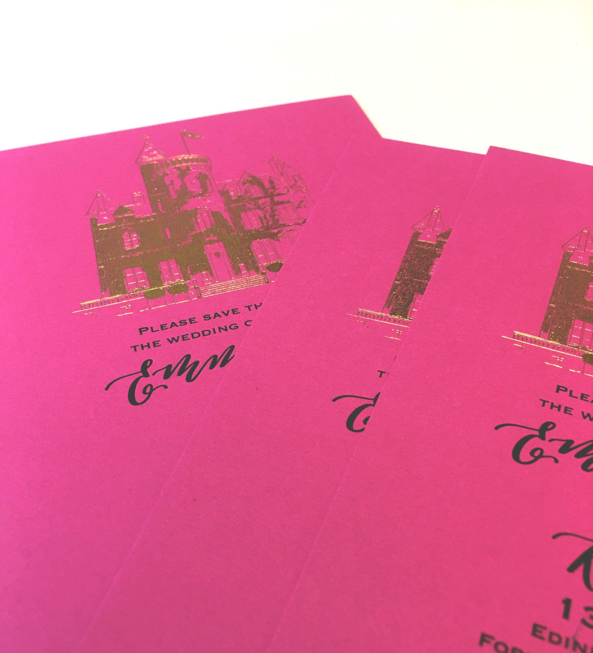
Think about the intended texture of the stock you would like when designing. We love textured stock and it can give your print character. it's important to remember how colours and text will appear on a bumpy surface. For example, if you use a strong background colour with a very fine typeface, your text might not end up legible.
We will never print something special for you without sending you a draft and getting it approved. This works for both of us! You know exactly what to expect and we know we're doing exactly what you want. If there are several ideas you want to see brought to life that is totally fine. Just remember this will add a day or two to the process!
Sizing is important. Create your file in the size that it is intended to be printed. If you design work at A5 then blow it up to A0 you're taking a risk! If you're savvy about print and have made a vector file it is totally scalable and you're good to go. It's jpegs and any raster file really that will end up one big blur!
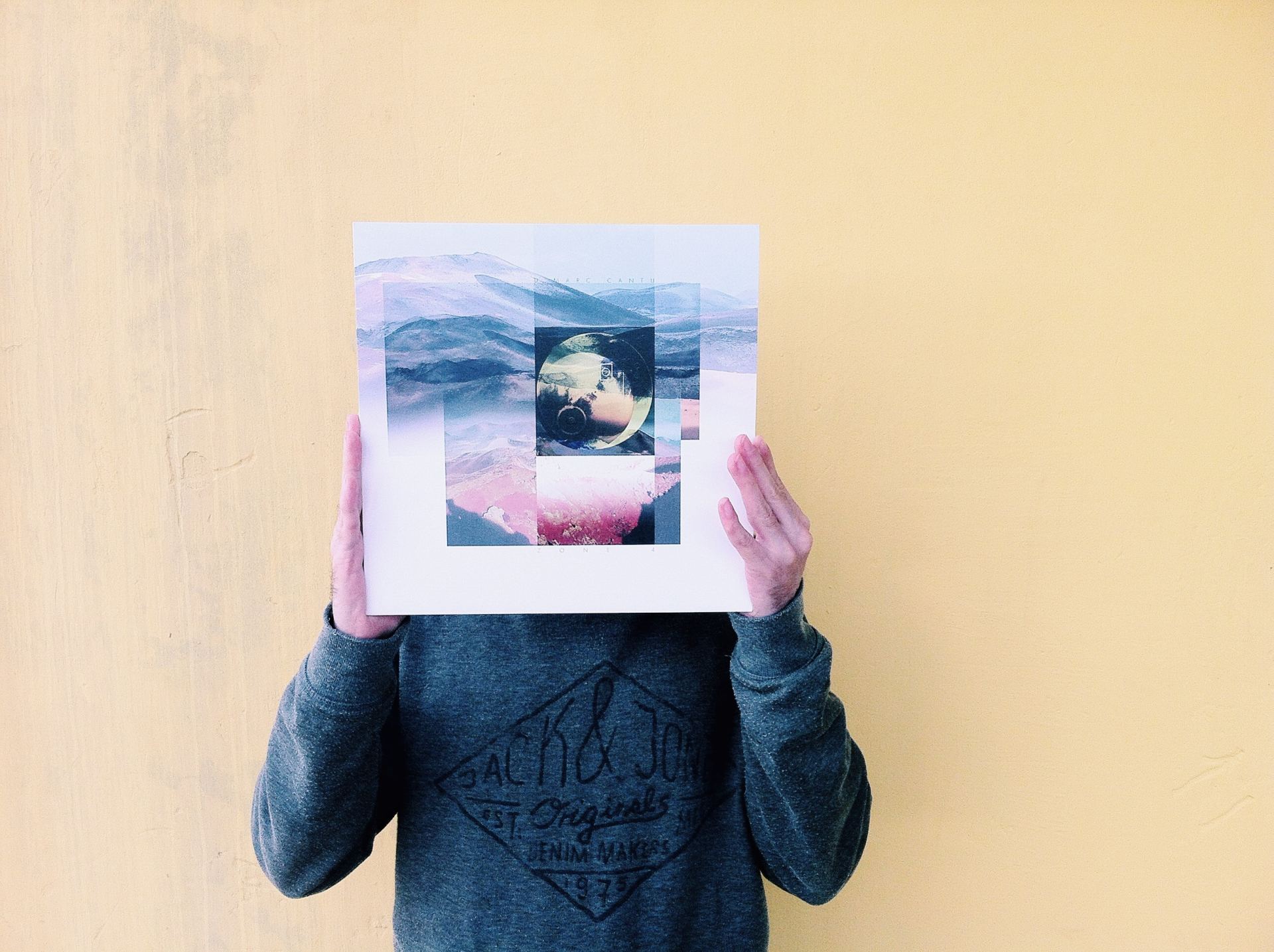
This is an insight into our printing process, and how we ensure your outcomes are as wonderful as your ideas.
For our more technical guidelines, hit the button below.
The gods have spoken, here's your colour of the year. How are you going to incorporate it into your print?

You can design for digital with your eyes closed. You’ve been asked to design for print, same thing right? No! Here are some tips to give your printer a break.
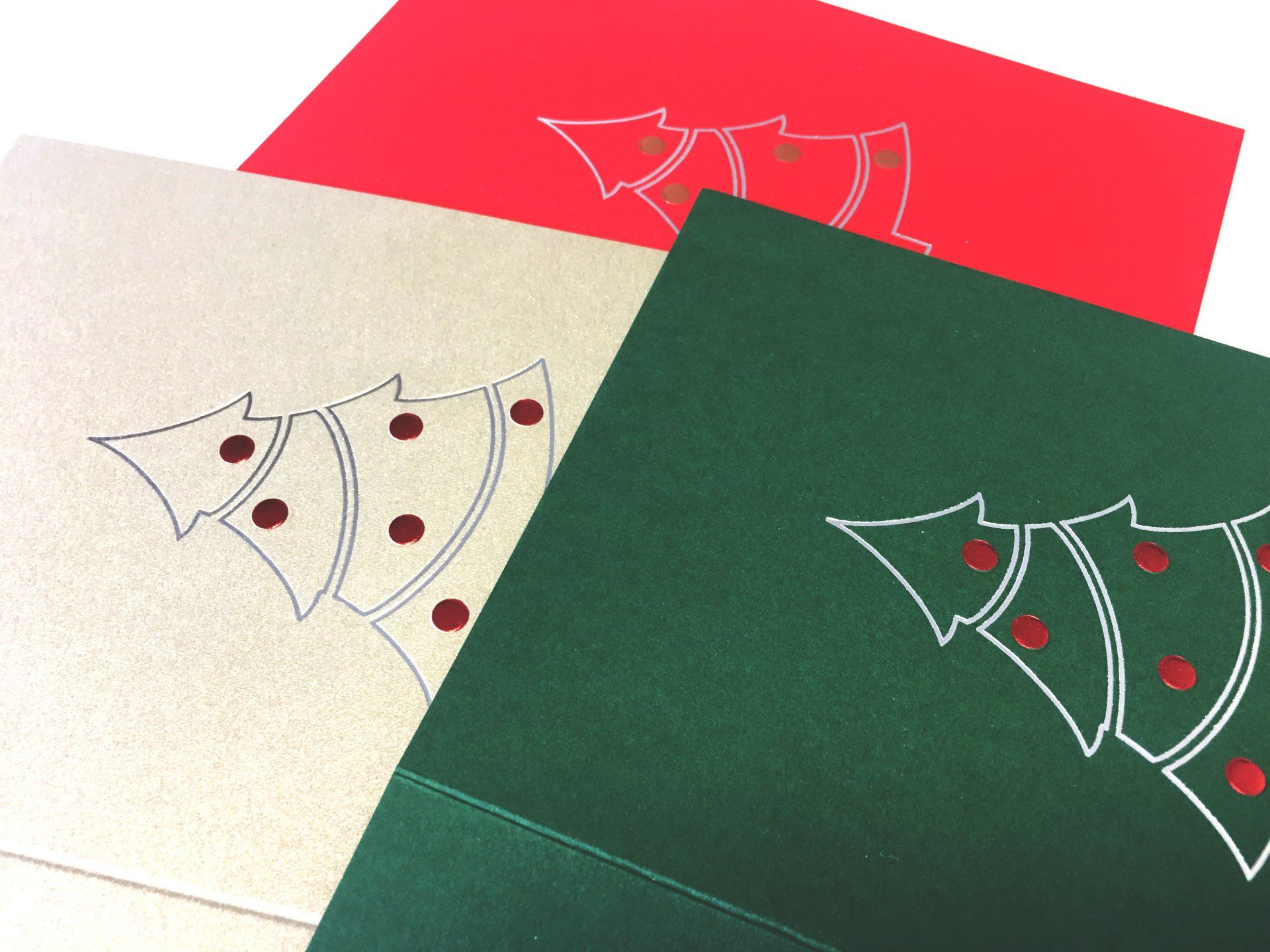
This year we've gone for a clean, simple foiled outline with embossed baubles. Here are some ideas for you.