
Inspired by
Marketing . • January 7, 2020
Classic blue, Pantone 19-4052.

How better could we start the New Year than with it's very own colour?
The Gods have spoken, and the colour of 2020 is Classic Blue.
The Pantone Colour Institute said that they recognised the instability and volatile nature of the world just now, and wanted a colour offering some calm and reassurance.
So we've all been recommended to incorporate a bit more blue into our lives.
We really hope you're going to do this with print.
If you know about designing for print, you'll know that your printer might not be too happy about printing Pantone colours, and neither will your bank account. Each of these spot colours require their own plate on the press.
Save yourself some time and effort and work in CMYK, use a range of blues, the depth, tone and contrast you can achieve is unlimited.
It's strong and legible for print, and as Pantone seem to know; comforting too.


You can design for digital with your eyes closed. You’ve been asked to design for print, same thing right? No! Here are some tips to give your printer a break.
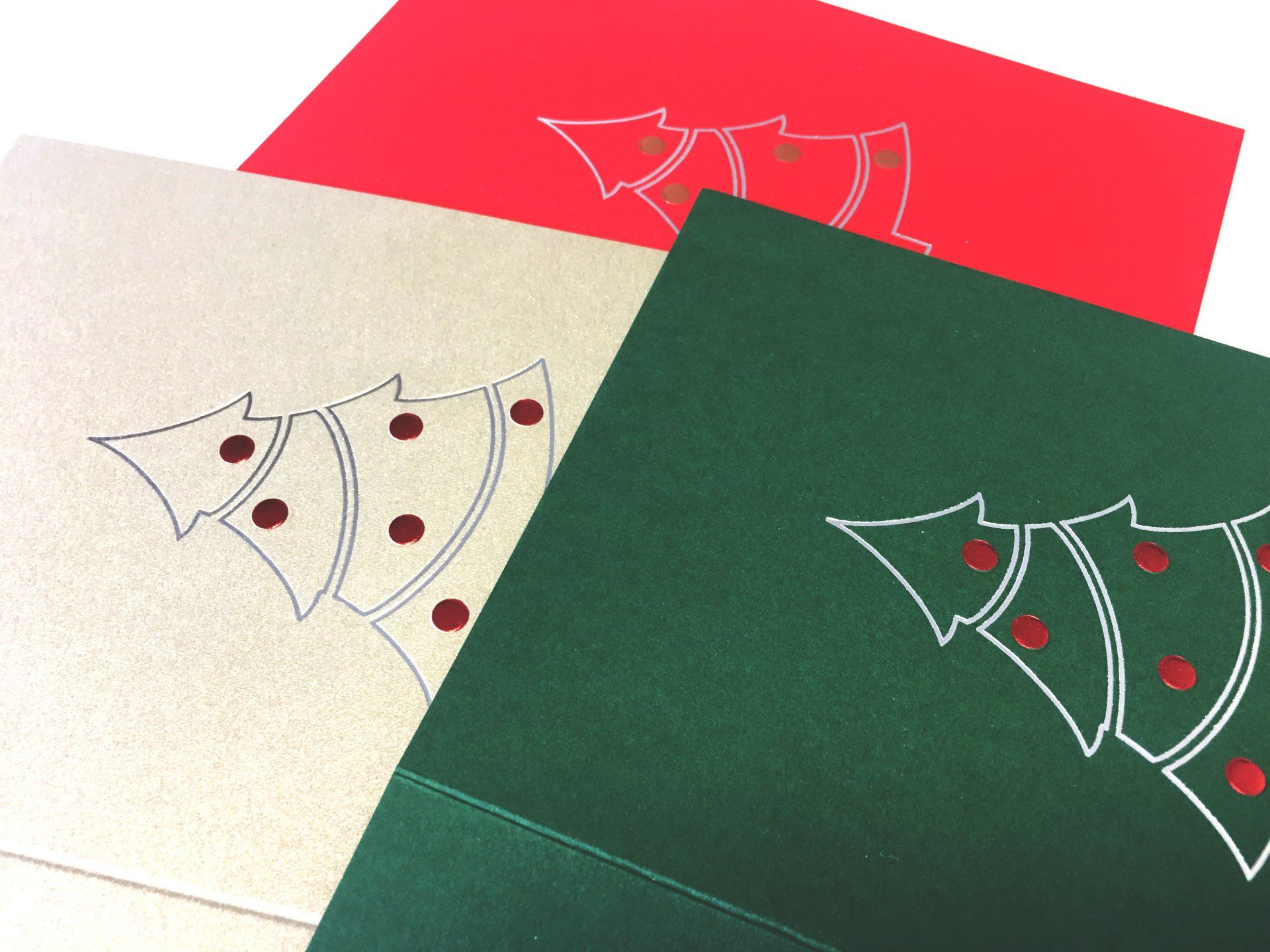
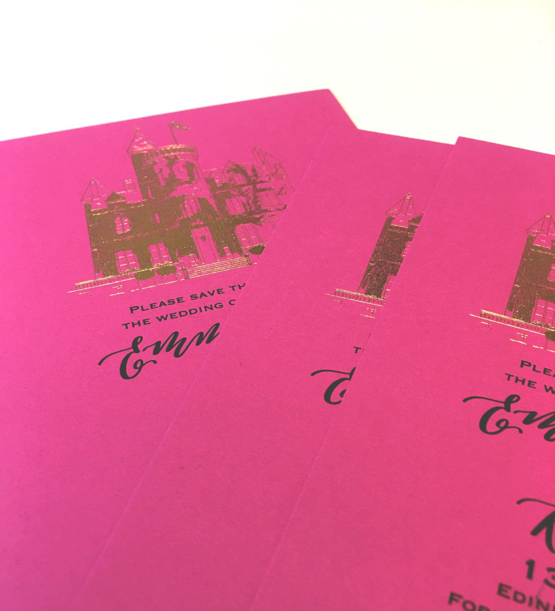
This year we've gone for a clean, simple foiled outline with embossed baubles. Here are some ideas for you.